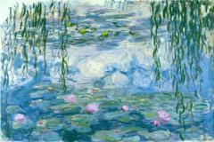
我有这个想法,这幅画在纽芬兰度假时。安静的,宁静的地区是什么我想要捕捉的绘画。我喜欢这个参考下图照片。但是,我想做别的事情在绘画。我想我应该把这些岛屿开,船会指出海湾向开放性的距离。它只是似乎对一个更好的成分。

在我24“×36”面板我抽出计划:

我的头排船,它将直接在那个圆点点背景。我猜,这成为二级集中在绘画、船之后,如果我有足够的元素的眼睛向外推至该区域。

提示的码头将提供一个链接到岸上作为方向线向船。

我封锁在主颜色:

我想保持阴云密布的天空。它似乎适合绘画。
我想展示在码头附近的海底。冷静,浅水将为一个伟大的入学到绘画和增加在所有上诉的观点。我从来没有尝试这个透明的水看起来之前。我开始将在主颜色的底部。然后我画粗糙形式看起来像岩石。

我使用Thalo蓝色,深蓝色,灰色,一点点的佩恩Napthol红色和白色主要是在水和天空的距离。我有一个釉或两种深褐色和黄色赭石也在那里。在前台有那些颜色加上深褐色,生黄土,黄色赭石。可能会有一个小烧棕土混杂在一起太。

我的下一步打算是涂料在遥远的山和岛。。它花了很多釉料和一些试图获得水和天空我想要它。我想要的,开放性的距离方向的负责人船将指向。要求密度的岛屿,将遥远的开放来排列的船似乎也打开视图眼出去海湾到最远入口。这帮助给这幅画感觉空间。宽阔开放的空间的感觉是一个美妙的感觉你会在纽芬兰。这是一个无人居住的土地,是98%。

我曾在玻璃更多和更好地定义了岩石。我使用的釉thalo蓝色,然后釉的深褐色,然后一个釉的黄色赭石。我重复这几次,非常小的颜料在釉料。我一直在的地方船会、开放,主要是为了记住它的放置区域。
借口模糊的照片但接下来的照片就显示我勾勒出了一个相当准确的轮廓的船。你必须小心在这一点上。如果图纸是不正确的,你可能会毁掉很多小时的工作。如果一个行了八分之一英寸这将是显而易见的。

当我确信大纲是正确的我封锁在船上基本颜色。我并不是很重视,绿色和红色是在大纲只要我不扰乱外线路。绿色是一个混合的氧化铬绿和thalo蓝色。红色是Cad地中海缓和了一点thalo与蓝色。

我现在从事岩石底部更多。我添加了更多的小石块和添加一些更多的釉料在这。

在这一点上我知道船看上去不像它坐在水中的权利。它可能是一种幻觉,因为红色和绿色在船没有在它们应该在的然而。我重新测量我的大纲,并意识到这是底线后面的船投掷下来。这听起来像我太特殊。但是,对于那些习惯于船和他们如何坐在水这些东西都是非常明显的。这是这是可以解决的。我也做了一些更多的重新定义岩石的底部。

我在这条船上工作再次。颜色看起来有点生在这个阶段和船内需要更多的工作。我重做,影子;其更多的影子那么一个反射。天空是阴暗的,所以我必须要把,好平衡在细节中,定义没有强大的阴影。更容易说然后做。大多数时候它容易有强烈的光线和阴影。我以为我是完成了下面的水船。唯一的区域,需要外出工作船是小岛在左边和指示的一个码头在右边。

接下来,我将更详细地上船。我改变了后看船的三倍。我决定在最后,我要让这一个简单的排船,不包括4.5 hp汽油驱动马达。这幅画将吸引我更多的没有噪音制造机。它只是不适合我的理想世界。其他的优势在不包括发动机是事实,你能想到的它的时间段是1940′年代不等到今天。如果我不使用鲜艳的红色和绿色,它已经可以追溯到1900 -今天。这些小木船有相同的基本风格对于一个世纪。

这些照片不是最好的质量,因为他们是带着只是房间里的光线没有闪光。当这幅画完成,我有一个更好的照片使用日光。

然后我在岛上工作在左边。其显示低潮和海带是可见的在低水位。这是一独特的海带在纽芬兰橙色/赭石/绿颜色取决于照明的一天。

那里是一个转变我的绘画技术在过去一年左右的时间。我发现玻璃的力量和优良性能乔纳丙烯酸玻璃液。
我做油漆的画的更不透明的方法。
但是,这一个已经完成了更多层次的釉然后我曾经使用过。我有大约20 - 25层中的水。起初我使用试图把釉料在只有玻璃液体和有一些困难与应用程序。但是现在我浸在水里,我刷釉液稀释。这似乎工作得更好,我没有得到一个厚的粘层,很难应用。
成功的秘诀玻璃似乎是在应用程序的很薄的外套,非常小的颜料,然后让每个涂层干申请前另一个。令人吃惊的是一层又一层稀薄的颜色能产生什么不透明漆可以不做。
我开始使用釉料越来越多的作为我继续学习绘画。
完成的画

油漆完的细节。

原文如下:
Acrylic Painting Demonstration: “At The Dock”
I got the idea for this painting while on vacation in Newfoundland. The quiet and serenity of this area was what I wanted to capture in the painting. I liked this reference image below as a photo. But, I wanted to do something else in a painting . I thought I would push the islands apart so that the boat would point out the bay towards the opening in the distance. It just seemed right for a better composition.
On my 24″ x 36″ panel I drew out the plan:
I lined the head of the boat up so that it would point directly at that dot in the background. I guessed that this would become the secondary focus in the painting, after the boat, if I had enough elements pushing the eye outward towards to that area.
The hint of the dock would provide a link from the boat to land and serve as a directional line toward the boat.
I blocked in the main colors:
I wanted to keep the overcast sky. It seemed to suit the painting.
I wanted to show the ocean bottom near the dock . Calm, shallow water would serve as a great enterance to the painting and add to the over all appeal of the view . I had never attempted this transparent water look before. I started by putting in the main colors of the bottom .Then I painted rough forms that looked like rocks .
I used Thalo blue , Ultramarine blue, Paynes grey, a tad of Napthol red, and White mostly in the water and sky in the distance. I have a glaze or two of burnt sienna and yellow ochre in there too. In the foreground there are those colors plus burnt sienna, raw sienna, yellow ochre . There may be a little burnt umber in the mix too.
My next move was to paint in the distant hills and island. . It took a lot of glazes and a few attempts to get the water and sky the way I wanted it. I wanted that opening in the distance to be in the direction that the head of the boat would be pointing towards. The pushing apart of the islands and moving the distant opening to line up with the boat seemed to also open up the view for the eye to go out the bay to the farthest inlet. This helped give the painting a feeling of space. The feel of wide open space is a wonderful sense you get in Newfoundland. It is a land that is 98 % unpopulated.
I worked on the glazing some more and defined the rocks better. I used glazes of thalo blue , then glazes of burnt sienna, then a glaze of yellow ochre. I repeated this several times with very little paint pigment in the glazes. I kept the area where the boat would be, open, mostly to keep in mind its placement area.
Excuse the blurred photo but the next photo just shows where I sketched a fairly accurate outline of the boat. You have to be very careful at this point. If the drawing is not right on, you could ruin many hours of work . If a line is off by an eighth of an inch it will be noticeable .
When I was sure the outline was right I blocked in the boat base colors. I wasn’t overly concerned where the green and red was inside the outline as long as I didn’t mess up the outer lines. The green is a mixture of Chromium oxide green and thalo blue. The red is Cad med toned down a bit with thalo blue.
I now worked on the rocks at the bottom more . I added a lot more little rocks and added a few more glazes over that.
At this point I knew the boat didn’t look like it was sitting right in the water . It could have been an optical illusion because the red and green inside the boat were not where they should be yet. I re-measured my outline and realized it was the bottom line at the back of the boat that was throwing it off. It may sound like I was being too particular. But, to someone who is accustomed to boats and how they sit in the water these things are very noticeable. It was something that was fixable . I also did some more redefining of the rocks at the bottom.
I worked on that boat again. The colors look a little raw at this stage and the boat interior needed more work. I re-worked that shadow; its more of a shadow then a reflection .The sky is overcast so I have to get that fine balance in the details , definition without strong shadows. Easier said then done . Most of the time its easier to have strong light and shadows. I thought I was finished with the water under the boat. The only areas that needed work outside the boat was the island on the left and the indication of a dock on the right side.
Next, I put a little more detail into the boat. I changed the rear look of the boat three times . I decided in the end that I was going to make this a simple row boat and not include that 4.5 hp gasoline driven outboard motor. The painting would appeal to me more without that noise making machine. It just don’t fit into my ideal world. The other advantage in not including a gas engine was the fact that one could think of its time period as being anywhere from 1940′s to today. If I didn’t use the bright red and green it could have been dated from 1900 – today. These little wooden boats had the same basic style for a century.
These photos aren’t the best quality because they were taken with just the light in the room without a flash. When the painting was done I got a better photo using daylight.
I then worked on the island on the left. Its showing low tide and the kelp is visible at the low water level. This kelp in Newfoundland is a distinct orange /ochre/ greenish color depending on the lighting of the day.
There as been a shift in my painting technique over the past year or so. I discovered the power of glazing and the excellent properties of Goldens acrylic glazing liquid.
I do paint the odd painting with the more opaque method.
But,this one will have been done with more layers of glaze then I have ever used before. I have about 20-25 layers in the water. At first I use to try and put glazes on with just glazing liquid and had some difficulty with application . But now I dip my brush in water more and dilute the glaze liquid . This seems to work much better and I don’t get a thick sticky layer that is hard to apply.
The secret to successful glazing seems to be in the application of very thin coats,with very little paint pigment in it , and then letting each coat dry before applying another. It is amazing how layer after layer of thin color can produce what opaque paint could never do.
I am starting to use glazes more and more as I continue learning about painting.
The finished painting
Detail of finished painting.
I hope you enjoyed the demo. You can contact me at brrice2003@yahoo.ca . Your comments would be greatly appreciated because feedback lets me know if these demos actually help others in their painting.